The home office works best when it is less home than office.
While the home office is your space, it may not be where you want to experiment too much. Afterall, streaming video has replaced the conference call and your once private space is now open to all attending. Of course, Zoom provides background filters to put you on a hill overlooking the Golden Gate Bridge, in space, or on a tropical beach, but many have found better results in repainting their offices. But, knowing what color to paint your home office is not going to be as easy as grabbing a bucket of your favorite color.
Think of the retail shopping experience. Most consumer spaces are designed to encourage spending. While lights and ambient music play significant roles, so too the colors of displays and the surrounding walls. Frequently, the tone is muted paint to contrast department names, brand logos, or blinking neon signs. They all work together to overwhelm the senses and make you think less about the cost of an item. Conversely, hospitals are usually soft colors like mint green. Doctor’s offices are increasingly decorated to reflect a homey environment. They do this to underwhelm the senses and calm panicked patients or comfort grieving families. The psychology of color is very real and you can use it in the home office to help keep you on task and influence productivity.
What most of us lost to the pandemic was the commute. While it is hard to feel sad about it, it turns out that threshold moment helped you be the person we needed to be at work and to leave that person behind when we go home. Creating a threshold moment is not that hard. All that is required is changing your surrounding without changing your location. This can be done as easily as repainting your office with colors that complement their existing color. That is, paint the room in colors the exact opposite of what they currently are.
Grounded Authority
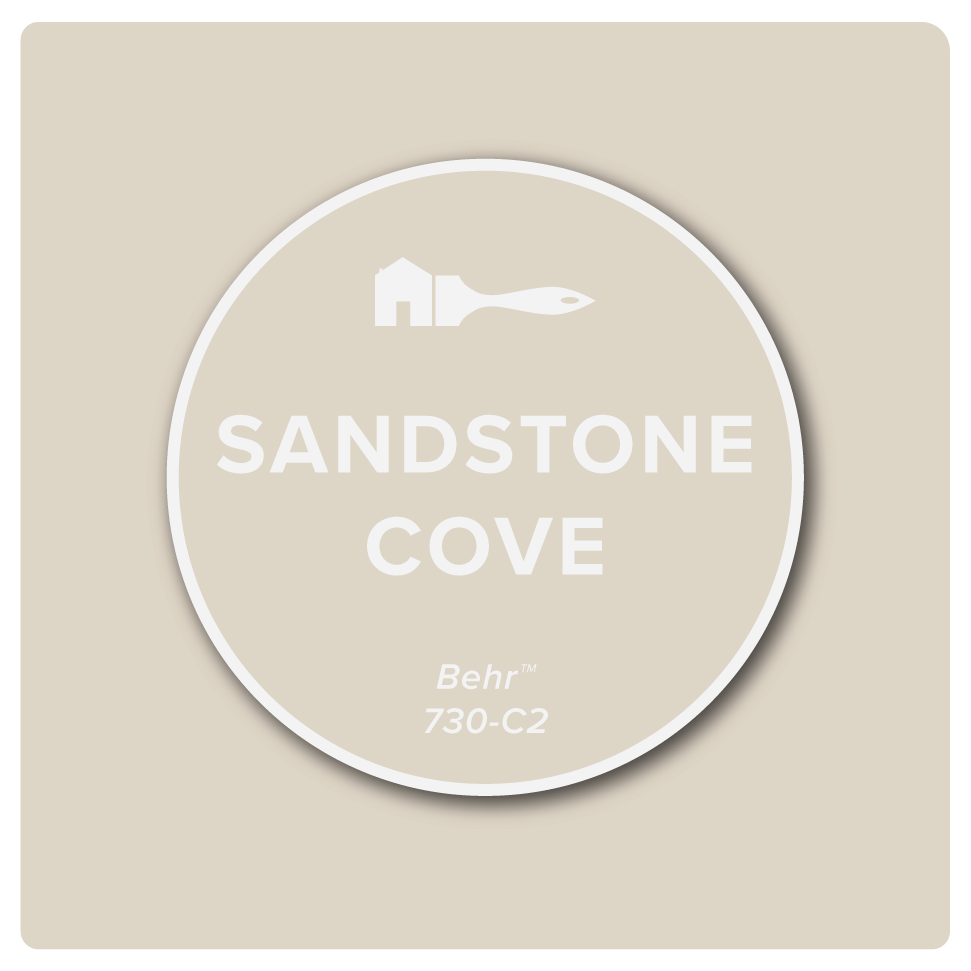
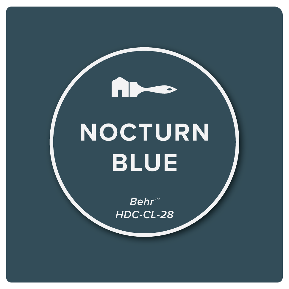
In the case of tan painted walls—such as Behr’s Sandstone Cove—Behr’s Nocturn Blue is the perfect complement and a color you want in your Zoom meeting background. A dark blue background in your zoom call lends a sense of authority to your online presence. But, for you working in that environment, it is calming and boosts your productivity. Meanwhile, earth tone shades of brown used sparingly can be grounding. Too much brown or tan shades, however, can kill and offer the appearance of dirty surroundings to outsiders looking-in. Used as dominant color schemes, brown and its offspring gray-brown Taupe and lighter, tan painted walls have been called uninspiring and oppressive colors that lead to disappointment and depression in the workplace.
Go with the flow
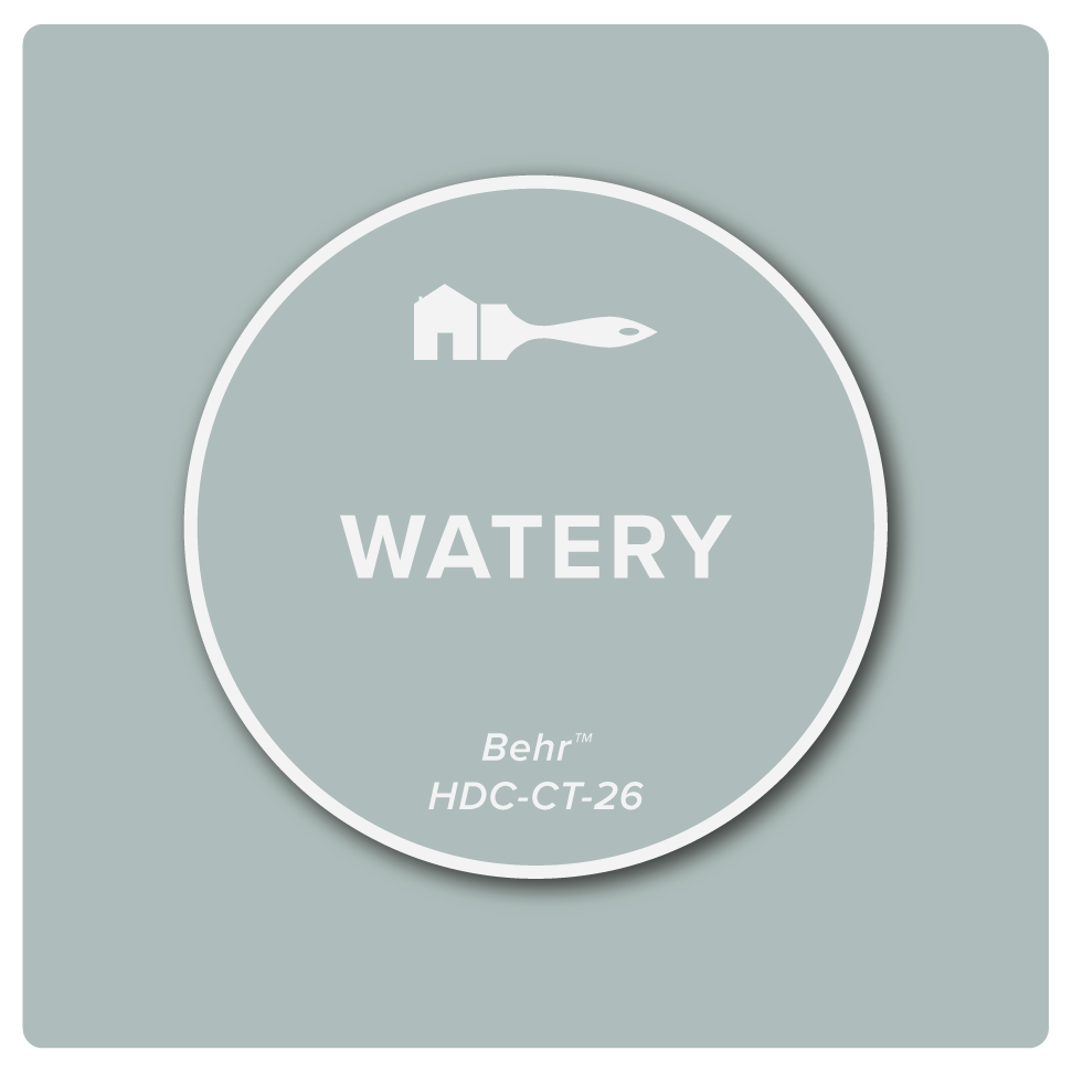
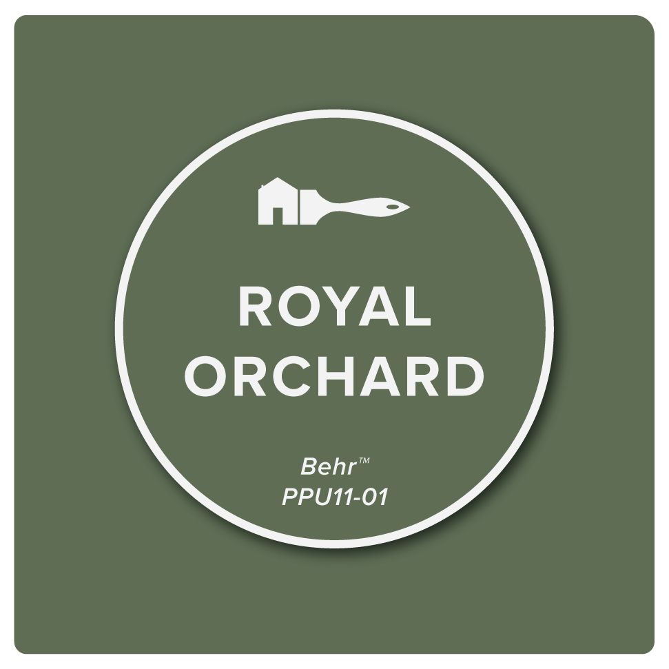
Perhaps it is the call to nature. Lighter shades like the blue-tinged gray of Behr’s Watery are said to reduce stress while the contracting wooded green of Royal Orchard can relieve stress. One reflects persistent strength to take on new tasks and the other is the calm balance of productive and creative. Combined, they are morale boosters with links to improved productivity and increased job satisfaction.
Light in the dark
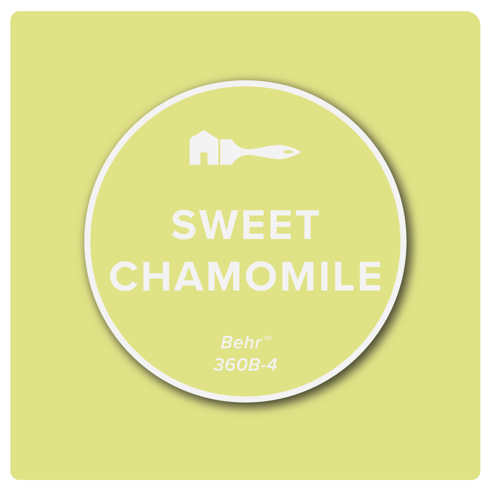
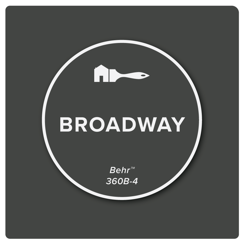
Sweet Chamomile is a warm shade of yellow, perfect for those long hours spent indoors. It speaks to hope and happiness. Like a light in the dark, it uplifts the spirit and illuminates the world. Paired with the darker Broadway, it pops like the sun’s rays bursting through a break in the clouds.
Actively creative
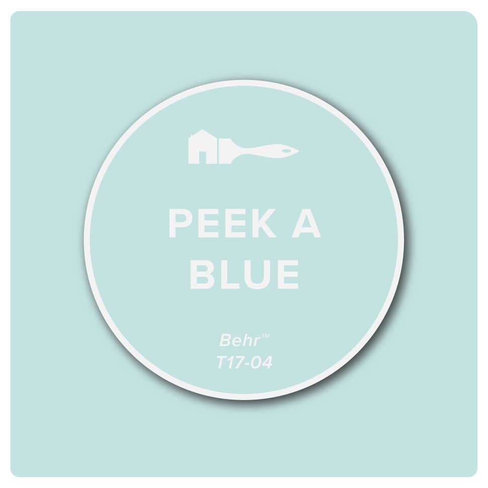
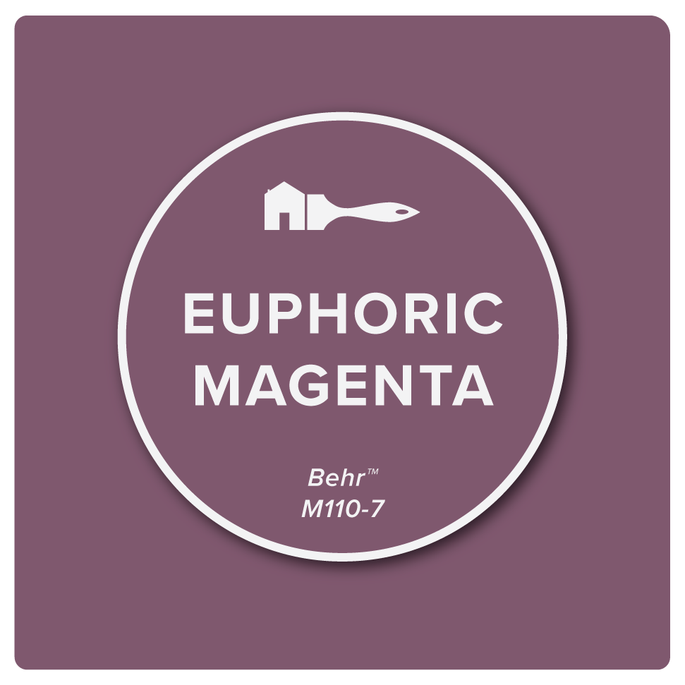
Away from colleagues, keeping a focused imagination can be a challenge. Brainstorming ideas over Slack is not the same as sitting across the table. Everything becomes calculated when we have time to realize there are such things as dumb ideas. Fortunately, like the light of day, a shade like Peak a Blue wakes the mind. Next to Euphoric Magenta, your creativity becomes fire. Purple is entirely synthetic, making it the color of creativity. Only violet appears in nature.
